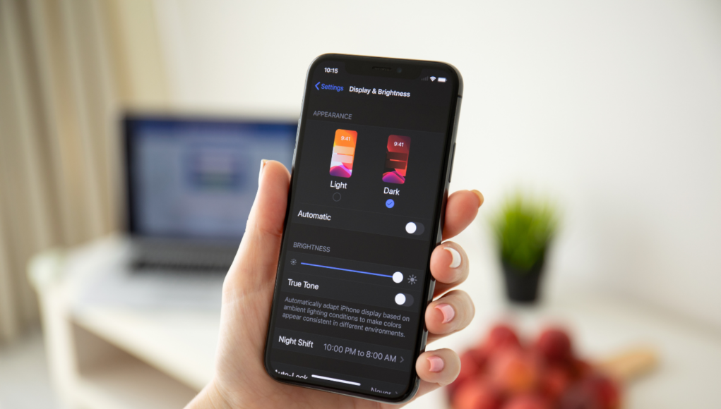
Dark mode. It might sound like the next movie in the Stars Wars saga, but it is in fact a widely used display setting available on your smartphone or laptop.
The decision makers at Apple and Android HQs decided to add it as an option on most models as dark mode reduces the light emitted by device screens, while maintaining the optimum colour contrast required for readability.
For the user, it means that, instead of the usual format of dark text showing up against a light screen, dark mode presents light coloured text against a black screen.
Is it just a question of taste?
No, there are several good reasons to switch to dark mode:
- It’s better for low-light settings – think keeping your partner awake at night or becoming a beacon of light in a dark cinema!
- Dark mode can reduce the amount of ‘blue light’ emitted from your phone. The reason many believe you can suffer sleep disturbances if you’ve got a habit of scrolling before snoozing.
- Some experts say it’s easier and healthier to read text against a dark background as it reduces eye strain.
- It’s widely believed that dark mode uses less energy, therefore increasing battery life.
- It can improve readability.
- Some apps, including Spotify, prefer the darker side of the colour wheel.
Dark mode has been around a while
If you’ve got a few years under your belt, then you will remember the instantly recognisable lines of yellow or white text on a black background on Ceefax or Teletext on your TV.
Early computer screens were also configured in dark mode, due to the restrictions of the original cathode-ray tubes.
The norm became dark text on light backgrounds because of the thinking that users wanted their digital material delivered on screens to resemble paper.
If you send emails in your marketing mix, should you now be considering designing for dark mode?
The answer is certainly yes! According to recent research by Android Authority, 81.9% of people they surveyed said they use dark mode as much as they can.
Making sure emails look great in light and dark modes is the new big challenge for email marketers.
The good news is that dark mode is currently supported by almost all the widely used email platforms, the bad news is it’s likely your fabulous designs won’t look the same across all of them.
The reason is that each email provider has its own way of rendering dark mode emails. Sounds problematic, but in fact, it breaks down to just three different ways in which your emails can render and the rules are fairly easy to navigate.
No colour change
The surrounding interface of the email platform changes to a dark theme, but there is no actual change to the email.
Partial colour change
Areas with light backgrounds are changed to dark, and dark text is changed to light.
Full colour change
In this version of dark mode, areas with existing dark backgrounds are changed to light, and light text is changed to dark. But the opposite happens with light backgrounds and dark text. This means an email with an original dark design will actually render with lighter colours in a full colour change scenario.
The 5 design rules to follow when designing emails for dark mode
Ramp up the colour contrast
The days of subtle, muted colour palettes are over. To work in dark mode your background and text colours must have sufficient contrast.
WCAG 2.0 standards require a minimum contrast ratio of 4.5:1 for regular text and 3:1 for large text (18pt or larger).
*Top tip. Use contrast-ratio.com to check your contrast ratio.
Use transparent backgrounds on images
If you’re using images, in most cases, it’s best to use transparent backgrounds, so that the image will change according to the background colour your theme sets.
Make sure your logo gets seen
Always use transparent PNGs for logos. Using other formats will result in a box showing around your logo in dark mode.
Also be aware if your logo is white and you’re using a black background or vice-versa, you might run into display issues in dark mode.
Add a translucent outline to transparent PNGs with dark text for legibility.
Consider how you use borders in your designs
Some email platforms render background and border colours differently in dark mode. That means that if you use the same colour for a background and a border, they may not render the same colour in dark mode.
Research using ‘invisible’ borders for padding purposes.
Tone down the white
Soften the colour of your white backgrounds. If you must use a white background for your content in Dark Mode, choose a slightly darker white that prevents the background from glowing against the surrounding dark content.
Finally, testing your messages in both light and dark modes is absolutely essential.
By testing your emails, you’ll have a better idea of what tricks work with what combinations, enabling you to get the most out of either setting.
Keeping these simple rules in mind will allow you to design emails that render just as effectively in dark mode as they do in the original formats.


